Side-by-side comparison chart
Compare two options in a balanced, scannable layout.

Original recipe · oimg.ai team · Jun 19, 2026
Original example prompt authored by the oimg.ai team — free to copy and adapt.
- Model
- Flux.1
- Aspect ratio
- 16:9
- 카테고리
- 인포그래픽 & 차트
변수를 바꿔보세요
이미지가 아니라 구조를 가져오세요. 강조된 {{TOKEN}}을 각각 원하는 소재로 바꾼 뒤 생성하세요.
A wide comparison graphic split into two columns for {{OPTION_A}} and {{OPTION_B}}, each headed by a bold label and a simple emblem. List {{ROW_COUNT}} short attribute rows aligned across both columns, with a center divider and alternating row shading. Use a restrained {{COLOR}} palette and generous padding. Render it as a clean data graphic with crisp, correctly spelled text.
효과적인 이유
- Mirrored columns and aligned rows make differences instantly scannable.
- Alternating shading guides the eye horizontally across each attribute.
- A restrained palette keeps focus on the content, not decoration.
나만의 버전 만들기
- 1프롬프트 복사하기
- 2나만의 소재와 디테일로 바꾸기
- 3생성하기
주의할 점
- Mismatched row counts break alignment; keep both sides equal.
관련 레시피
View all prompts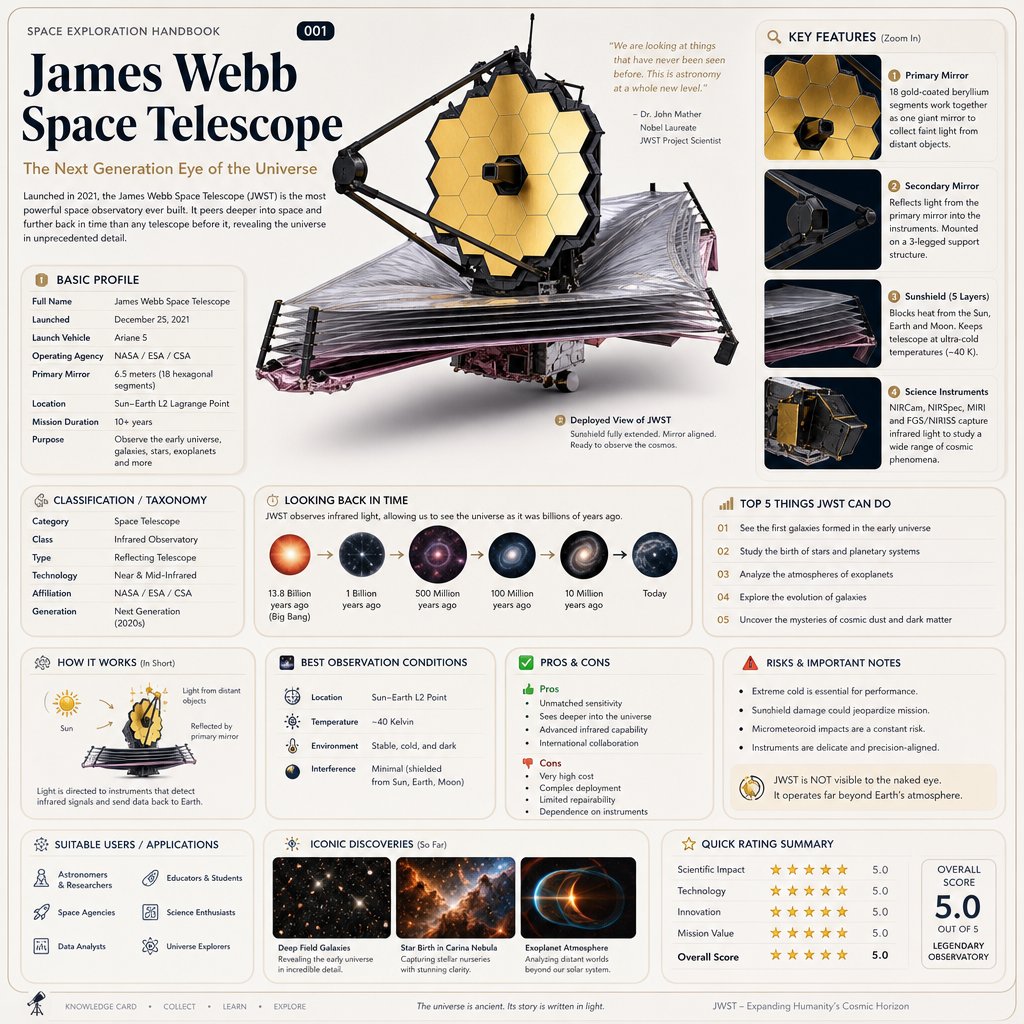 GPT Image 2
Based on { TOPIC }
Real prompt shared by @oggii_0 on X
 GPT Image 2
gpt-image-2
Real prompt shared by @rohanpaul_ai on X
 GPT Image 2
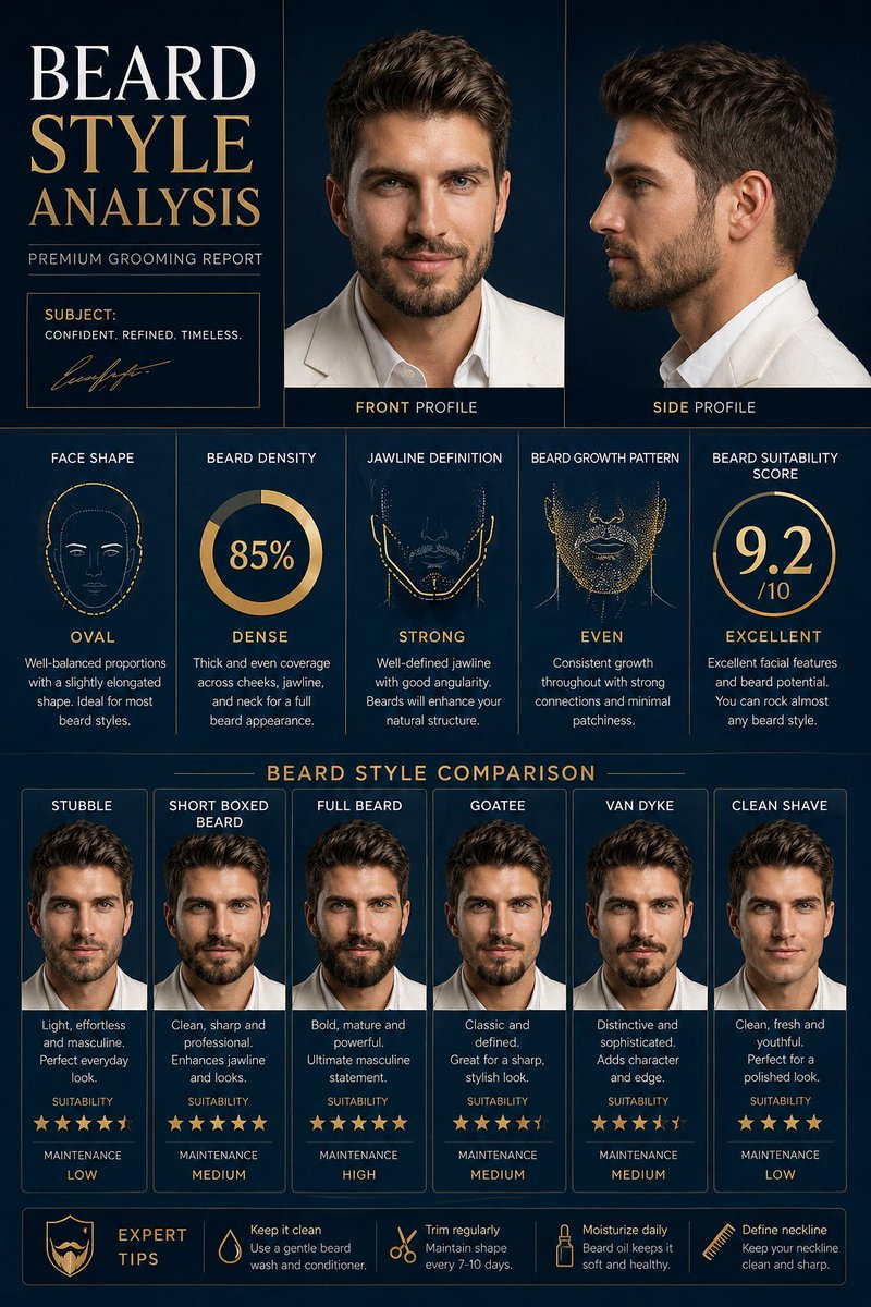
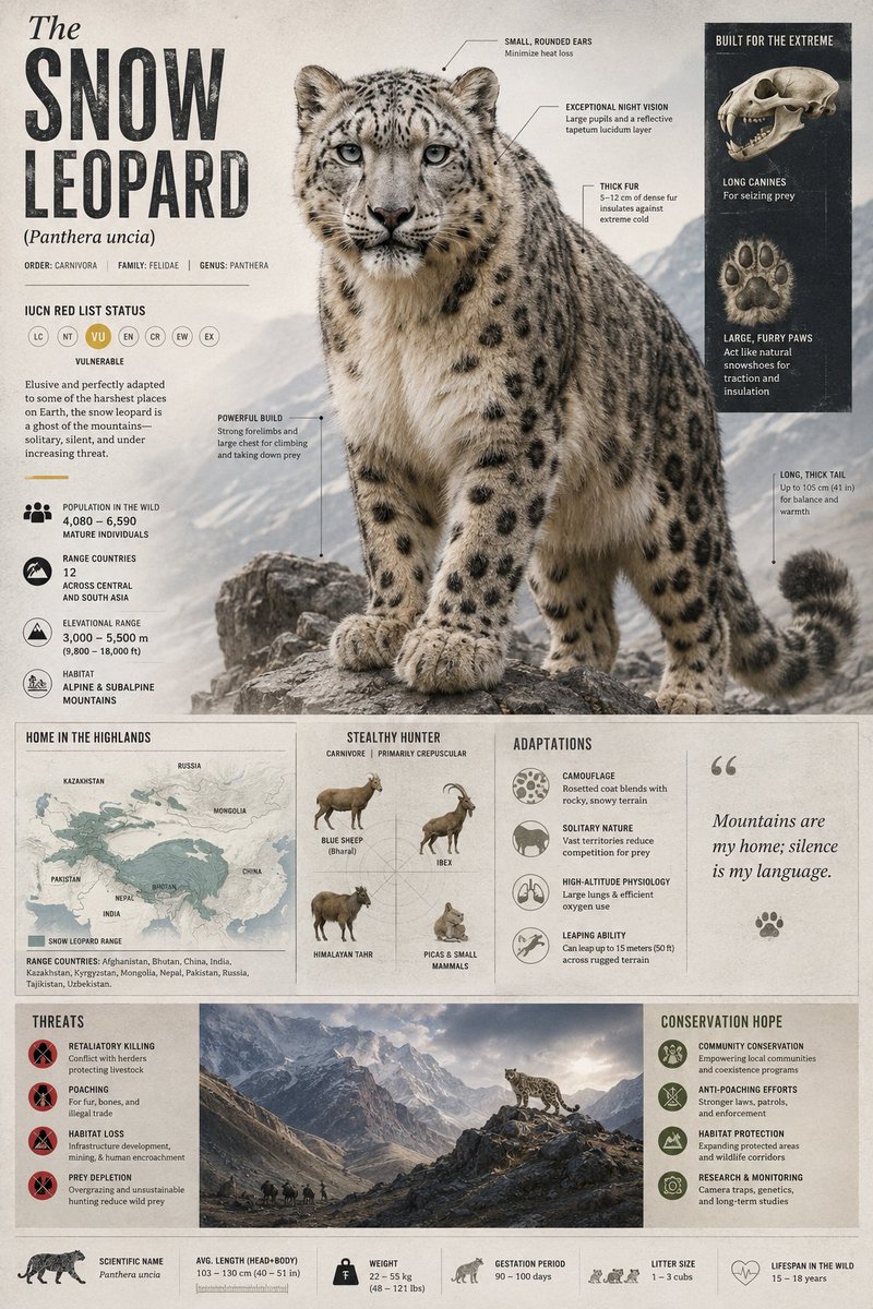
Comprehensive Facial Hair Analysis & Styling Guide 💎
Real prompt shared by @RizwanAly07 on X
 GPT Image 2
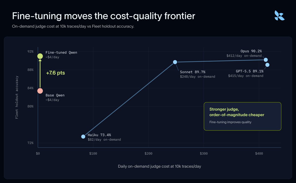
langchain and fireworks just shipped the eval move worth ste
Real prompt shared by @rohit4verse on X
 GPT Image 2
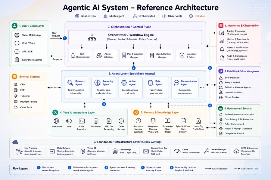
Most people talk about Agentic AI.
Real prompt shared by @MeenakshiYACS on X
 GPT Image 2
GPT Image 2 on ChatGPT
Real prompt shared by @john_my07 on X
 GPT Image 2
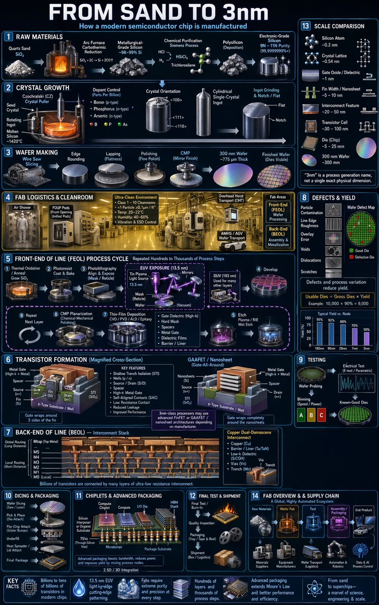
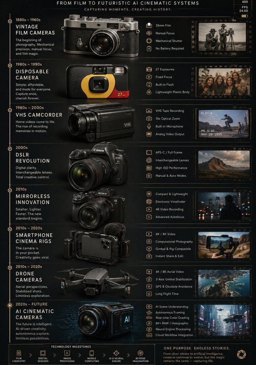
Ultra detailed vertical infographic poster showing the evolu
Real prompt shared by @AIwithkhan on X
 GPT Image 2
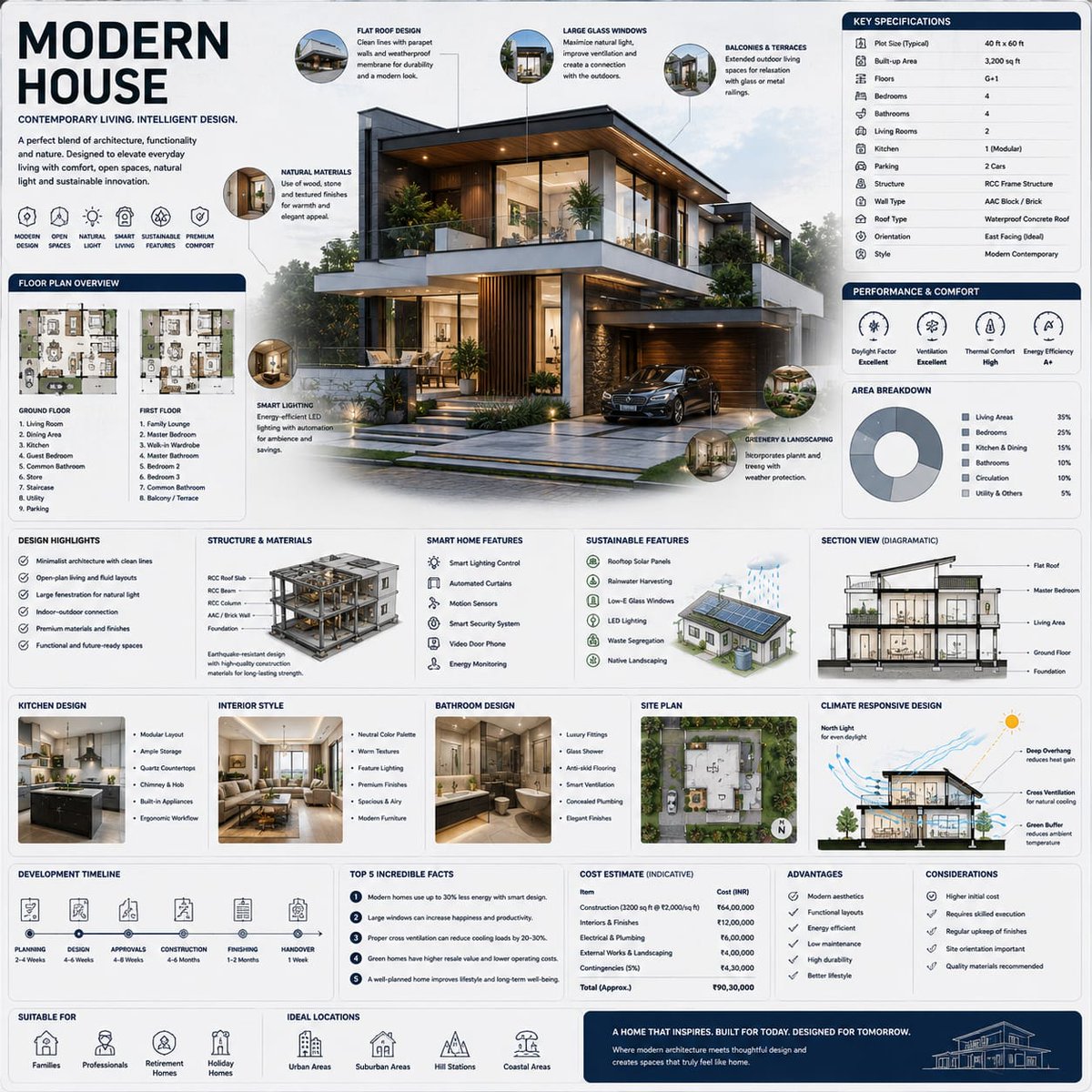
Modern House infographics created using GPT Image 2 on ChatG
Real prompt shared by @mehvishs25 on X